If you were to read a web designer’s Christmas wish list, it would likely include a solution for displaying images responsively. For those concerned about users downloading unnecessary image data, or serving images that look blurry on high resolution displays, finding a solution has become a frustrating quest.
Having experimented with complex and sometimes devilish hacks, consensus is forming around defining new standards that could solve this problem. Two approaches have emerged.
The <picture> element markup pattern was proposed by Mat Marquis and is now being developed by the Responsive Images Community Group. By providing a means of declaring multiple sources, authors could use media queries to control which version of an image is displayed and under what conditions:
A second proposal put forward by Apple, the srcset attribute, uses a more concise syntax intended for use with the <img> element, although it could be compatible with the <picture> element too. This would allow authors to provide a set of images, but with the decision on which to use left to the browser:
Men’s courses will foreshadow certain ends, to which, if persevered in, they must lead.
Ebenezer Scrooge
Given the complexity of this issue, there’s a heated debate about which is the best option. Yet code belies a certain truth. That both feature verbose and opaque syntax, I’m not sure either should find its way into the browser – especially as alternative approaches have yet to be fully explored.
So, as if to dampen the festive cheer, here are five reasons why I believe both proposals are largely redundant.
1. We need better formats, not more markup
As we move away from designs defined with fixed pixel values, bitmap images look increasingly unsuitable. While simple images and iconography can use scalable vector formats like SVG, for detailed photographic imagery, raster formats like GIF, PNG and JPEG remain the only suitable option.
There is scope within current formats to account for varying bandwidth but this requires cooperation from browser vendors. Newer formats like JPEG2000 and WebP generate higher quality images with smaller file sizes, but aren’t widely supported.
While it’s tempting to try to solve this issue by inventing new markup, the crux of it remains at the file level.
Daan Jobsis’s experimentation with image compression strengthens this argument. He discovered that by increasing the dimensions of a JPEG image while simultaneously reducing its quality, a smaller files could be produced, with the resulting image looking just as good on both standard and high-resolution displays.
This may be a hack in lieu of a more permanent solution, but it’s applied in the right place. Easy to accomplish with existing tools and without compatibility issues, it has few downsides. Further experimentation in this area should be encouraged, with standardisation efforts more helpful if focused on developing new image formats or, preferably, extending existing ones.
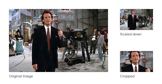
2. Art direction doesn’t belong in markup
A desired benefit of the <picture> markup pattern is to allow for greater art direction. For example, rather than scaling down images on smaller displays to the point that their content is hard to discern, we could present closer crops instead:
This can be achieved with CSS of course, although with a download penalty for those parts of an image not shown. This point may be negligible, however, since in the context of adaptable layouts, these hidden areas may end up being revealed anyway.
Art direction concerns design, not content. If we wish to maintain a separation of concerns, including presentation within our markup seems misguided.
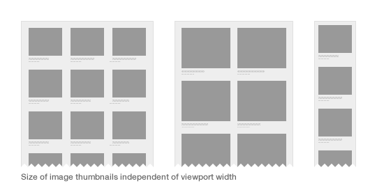
3. The size of a display has little relation to the size of an image
By using media queries, the <picture> element allows authors to choose which characteristics of the screen or viewport to query for different images to be displayed.
In developing sites at Clearleft, we have noticed that the viewport is essentially arbitrary, with the size of an image’s containing element more important. For example, look at how this grid of images may adapt at different viewport widths:
As we build more modular systems, components need to be adaptable in and of themselves. There is a case to be made for developing more contextual methods of querying, rather than those based on attributes of the display.
4. We haven’t lived with the problem long enough
A key strength of the web is that the underlying platform can be continually iterated. This can also be problematic if snap judgements are made about what constitutes an improvement.
The early history of the web is littered with such examples, be it the perceived need for blinking text or inline typographic styling. To build a platform for the future, additions to it should be carefully considered. And if we want more consistent support across browsers, burdening vendors with an ever increasing list of features seems counterproductive.
Only once the need for a new feature is sufficiently proven, should we look to standardise it. Before we could declare hover effects, rounded corners and typographic styling in CSS, we used JavaScript as a polyfill. Sure, doing so was painful, but use cases were fully explored, and the CSS specification better reflected the needs of authors.
5. Images and the web aesthetic
The srcset proposal has emerged from a company that markets its phones as being able to browse the real – yet squashed down, tapped and zoomable – web. Perhaps Apple should make its own website responsive before suggesting how the rest of us should do so.
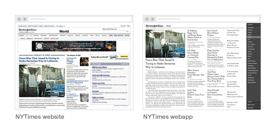
Converserly, while the <picture> proposal has the backing of a few respected developers and designers, it was born out of the work Mat Marquis and Filament Group did for the Boston Globe. As the first large-scale responsive design, this was a landmark project that ignited the responsive web design movement and proved its worth. But it was the first.
Its design shares a vernacular to that of contemporary newspaper websites, with a columnar, image-laden and densely packed layout. Compared to more recent examples – Quartz, The Next Web and the New York Times Skimmer – it feels out of step with the future direction of news sites. In seeking out a truer aesthetic for the web in which software interfaces have greater influence, we might discover that the need for responsive images isn’t as great as originally thought.
Building for the future
With responsive design, we’ve accepted the idea that a fully fluid layout, rather than a set of fixed layouts, is best suited to the web’s unpredictable nature. Current responsive image proposals are antithetical to this approach.
We need solutions that lack complexity, are device-agnostic and work within existing workflows. Any proposal that requires different versions of the same image to be created, is likely to have to acquiesce under the pressure of reality.
While it’s easy to get distracted about the size and quality of an image, and how we might choose to serve it, often the simplest solution is not to include it at all. After years of gluttonous design practice, in which fast connections and expansive display sizes were an accepted norm, we have got use to filling pages will needless images and countless items of page furniture.
To design more adaptable experiences, the presence of every element needs to be questioned, for its existence requires additional data to be downloaded or futher complexity within a design system. Conditional loading techniques mean that the inclusion of images is no longer a binary choice, but can instead appear in a progressively enhanced manner.
So here is my proposal. Instead of spending the next year worrying about responsive images, let’s embrace the constraints of the medium, and seek out new solutions that can work within them.
Responsive web design is showing us that designing content is more important than designing containers. But if you’ve given RWD a serious try, you know that shifting your focus from the container is surprisingly hard to do. There are many factors and
instincts working against you, and one culprit is a perpetrator you’d least suspect.
The media query is the ringmaster of responsive design. It lets us establish the rules of the game and gives us what we need most: control. However, like some kind of evil double agent, the media query is actually working against you.
Its very nature diverts your attention away from content and forces you to focus on the container.
The very act of choosing a media query value means choosing a screen size.
Look at the history of the media query—it’s always been about the container. Values like screen, print, handheld and tv don’t have anything to do with content. The modern media query lets us choose screen dimensions, which is great because it makes RWD possible. But it’s still the act of choosing something that is completely unpredictable.
Content should dictate our breakpoints, not the container. In order to get our focus back to the only thing that matters, we need a reengineered media query—one that frees us from thinking about screen dimensions. A media query that works for your content, not the window. Fortunately, Sass 3.2 is ready and willing to take on this challenge.
Thinking in Columns
Fluid grids never clicked for me. I feel so disoriented and confused by their squishiness. Responsive design demands their use though, right?
I was ready to surrender until I found a grid that turned my world upright again. The Frameless Grid by Joni Korpi demonstrates that column and gutter sizes can stay fixed. As the screen size changes, you simply add or remove columns to accommodate. This made sense to me and armed with this concept I was able to give Sass the first component it needs to rewrite the media query: fixed column and gutter size variables.
$grid-column: 60px;
			$grid-gutter: 20px;
We’re going to want some resolution independence too, so let’s create a function that converts those nasty pixel values into ems.
We now have the components needed to figure out the width of multiple columns in ems. Let’s put them together in a function that will take any number of columns and return the fixed width value of their size.
With the math in place we can now write a mixin that takes a column count as a parameter, then generates the perfect media query necessary to fit that number of columns on the screen. We can also build in some left and right margin for our layout by adding an additional gutter value (remembering that we already have one gutter built into our fixed function).
And, just like that, we’ve rewritten the media query. Instead of picking a minimum screen size for our layout, we can simply determine the number of columns needed. Let’s add a wrapper class so that we can center our content on the screen.
Designing content with a column count gives us nice, easy, whole numbers to work with. Sizing content, sidebars or widgets is now as simple as specifying a single-digit number.
Those four lines of Sass just created a responsive layout for us. When the screen is big enough to fit eight columns, it will trigger a fixed width layout. And give widths to our main content and sidebar. The following is the outputted CSS…
I’ve created a Codepen demo that demonstrates what we’ve covered so far. I’ve added to the demo some grid classes based on Griddle by Nicolas Gallagher to create a floatless layout. I’ve also added a CSS gradient overlay to help you visualize columns. Try changing the column variable sizes or the breakpoint includes to see how the layout reacts to different screen sizes.
Responsive Images
Responsive images are a serious problem, but I’m excited to see the community talk so passionately about a solution. Now, there are some excellent stopgaps while we wait for something official, but these solutions require you to mirror your breakpoints in JavaScript or HTML. This poses a serious problem for my Sass-generated media queries, because I have no idea what the real values of my breakpoints are anymore. For responsive images to work, JavaScript needs to recognize which media query is active so that proper images can be loaded for that layout.
What I need is a way to label my breakpoints. Fortunately, people much smarter than I have figured this out. Jeremy Keith devised a labeling method by using CSS-generated content as the storage method for breakpoint labels. We can use this technique in our breakpoint mixin by passing a label as another argument.
This allows us to label our breakpoints with a user-friendly string. Now that our media queries are defined and labeled, we just need JavaScript to step in and read which label is active.
// get css generated label for active media query
			var label = getComputedStyle(document.body, '::before')['content'];
JavaScript now knows which layout is active by reading the label in the current media query—we just need to match that label to an image. I prefer to store references to different image sizes as data attributes on my image tag.
These data attributes have names that match the labels set in my CSS. So while there is some duplication going on, setting a keyword like ‘tablet’ in two places is much easier than hardcoding media query values. With matching labels in CSS and HTML our script can marry the two and load the right sized image for our layout.
// get css generated label for active media query
			var label = getComputedStyle(document.body, '::before')['content'];

			// select image
			var $image = $('.responsive-image');

			// create source from data attribute
			$image.attr('src', $image.data(label));
Demo
With some slight additions to our previous Codepen demo you can see this responsive image technique in action. While the above JavaScript will work it is not nearly robust enough for production so the demo uses a jQuery plugin that can accomodate multiple images, reloading on screen resize and fallbacks if something doesn’t match up.
Creating a Framework
This media query mixin and responsive image JavaScript are the center piece of a front end framework I use to develop websites. It’s a fluid, mobile first foundation that uses the breakpoint mixin to structure fixed width layouts for tablet and desktop. Significant effort was focused on making this framework completely cross-browser. For example, one of the problems with using media queries is that essential desktop structure code ends up being hidden from legacy Internet Explorer. Respond.js is an excellent polyfill, but if you’re comfortable serving a single desktop layout to older IE, we don’t need JavaScript. We simply need to capture layout code outside of a media query and sandbox it under an IE only class name.
// set IE fallback layout to 8 columns
			$ie-support = 8;

			// inside of our breakpoint mixin (but outside the media query)
			@if ($ie-support and $min <= $ie-support) {
				.lt-ie9 { @content; }
			}
Perspective Regained
Thinking in columns means you are thinking about content layout. How big of a screen do you need for 12 columns? Who cares? Having Sass write media queries means you can use intuitive numbers for content layout. A fixed grid means more layout control and less edge cases to test than a fluid grid. Using CSS labels for activating responsive images means you don’t have to duplicate breakpoints across separations of concern.
It’s a harmonious blend of approaches that gives us something we need—responsive design that feels intuitive. And design that, from the very outset, focuses on what matters most. Just like our kindergarten teachers taught us: It’s what’s inside that counts.
Class is only becoming more important. Focusing on its original definition as an attribute for grouping (or classifying) as well as linking HTML to CSS, recent front-end development practices are emphasizing class as a vessel for structured, modularized style packages. These patterns reduce the need for repetitive declarations that can seriously bloat file sizes, and instil human-readable understanding of how the interface, layout, and aesthetics are constructed.
In the next handful of paragraphs, we will look at how these emerging practices – such as object-oriented CSS and SMACSS – are pushing the relevance of class. We will also explore how HTML and CSS architecture can be further simplified, performance can be boosted, and CSS utility sharpened by combining class with the attribute selector.
A primer on attribute selectors
While attribute selectors were introduced in the CSS 2 spec, they are still considered rather exotic. These well-established and well-supported features give us vastly improved flexibility in targeting elements in CSS, and offer us opportunities for smarter markup. With an attribute selector, you can directly style an element based on any of its unique – or uniquely shared – attributes, without the need for an ID or extra classes. Unlike pseudo-classes, pseudo-elements, and other exciting features of CSS3, attribute selectors do not require any browser-specific syntax or prefix, and are even supported in Internet Explorer 7.
For example, say we want to target all anchor tags on a page that link to our homepage. Where otherwise we might need to manually identify and add classes to the HTML for these specific links, we could simply write:
[href=index.html] { }
This selector reads: target every element that has an href attribute of “index.html”.
Attribute selectors are more faceted, though, as they also give us some very simple regular expression-like logic that helps further narrow (or widen) a selector’s scope. In our previous example, what if we wanted to also give indicative styles to any anchor tag linking to an external site? With no way to know what the exact href value would be for every external link, we need to use an expression to match a common aspect of those links. In this case, we know that all external links need to start with “http”, so we can use that as a hook:
[href^=http] { }
The selector here reads: target every element that has an href attribute that begins with “http” (which will also include “https”). The ^= means “starts with”. There are a few other simple expressions that give us a lot of flexibility in targeting elements, and I have found that a deep understanding of these and other selector types to be very useful.
The class-attribute selector
By matching classes with the attribute selector, CSS can be pushed to accomplish some exciting new feats. What I call a class-attribute selector combines the advantages of classes with attribute selectors by targeting the class attribute, rather than a specific class. Instead of selecting .urgent, you could select [class*=urgent]. The latter may seem like a more verbose way of accomplishing the former, but each would actually match two subtly different groups of elements.
Eric Meyer first explored the possibility of using classes with attribute selectors over a decade ago. While his interest in this technique mostly explored the different facets of the syntax, I have found that using class-attribute selectors can have distinct advantages over either using an attribute selector or a straightforward class selector.
First, let’s explore some of the subtleties of why we would target class before other attributes:
Classes are ubiquitous. They have been supported since the HTML 4 spec was released in 1999. Newer attributes, such as the custom data attribute, have only recently begun to be adopted by browsers.
Classes have multiple ways of being targeted. You can use the class selector or attribute selector (.classname or [class=classname]), allowing more flexible specificity than resorting to an ID or !important.
Classes are already widely used, so adding more classes will usually require less markup than adding more attributes.
Classes were designed to abstractly group and specify elements, making them the most appropriate attribute for styling using object-oriented methods (as we will learn in a moment).
Also, as Meyer pointed out, we can use the class-attribute selector to be more strict about class declarations. Of these two elements:
<h2 class="very urgent">
<h2 class="urgent">
…only the second h2 would be selected by [class=urgent], while .urgent would select both. The use of = matches any element with the exact class value of “urgent”. Eric explores these nuances further in his series on attribute selectors, but perhaps more dramatic is the added power that class-attribute selectors can bring to our CSS.
More object-oriented, more scalable and modular
Nicole Sullivan has been pushing abstracted, object-oriented thinking in CSS development for years now. She has shared stacks of knowledge on how behemoth sites have seen impressive gains in maintenance overhead and CSS file sizes by leaning heavier on classes derived from common patterns. Jonathan Snook also speaks, writes and is genuinely passionate about improving our markup by using more stratified and modular class name conventions. With SMACSS, he shows this to be highly useful across sites – both complex and simple – that exhibit repeated design patterns. Sullivan and Snook both push the use of class for styling over other attributes, and many front-end developers are fast advocating such thinking as best practice.
With class-attribute selectors, we can further abstract our CSS, pushing its scalability. In his chapter on modules, Snook gives the example of a .pod class that might represent a certain set of styles. A .pod style set might be used in varying contexts, leading to CSS that might normally look like this:
.pod {  }
		form .pod {  }
		aside .pod {  }
According to Snook, we can make these styles more portable by targeting more verbose classes, rather than context:
This divorces the <div>’s styles from its context, making it applicable to any situation in which it is needed. The markup is clean and portable, and the classes are imbued with meaning as to what module they belong to.
Using class-attribute selectors, we can simplify this further:
[class*=pod] {  }
		.pod-form {  }
		.pod-sidebar {  }
The *= tells the browser to look for any element with a class attribute containing “pod”, so it matches “pod”, “pod-form”, “pod-sidebar”, etc. This allows only one class per element, resulting in simpler HTML:
We could further abstract the concept of “form” and “sidebar” adjustments if we knew that each of those alterations would always need the same treatment.
Classes are just powerful enough to override element selectors and default styling, but still leave room to be trumped by IDs and !important styles. This makes them more suitable for object-oriented patterns and helps avoid messy specificity issues that can not only be a pain for developers to maintain, but can also affect a site’s performance. As Sullivan notes, “In almost every case, classes work well and have fewer unintended consequences than either IDs or element selectors”. Proper use of specificity and cascade is crucial in building straightforward, efficient CSS.
One interesting aspect of attribute selectors is that they can be compounded for increasing levels of specificity. Attribute selectors are assigned a specificity level of ten, the same as class selectors, but both class and attribute selectors can be chained together, giving them more and more specificity with each link. Some examples:
.box {  }
		/* Specificity of 10 */

		.box.promo {  }
		/* Specificity of 20 */

		[class*=box] {  }
		/* Specificity of 10 */

		[class*=box][class*=promo] {  }
		/* Specificity of 20 */
You can chain both types together, too:
.box[class*=promo] {  }
		/* Specificity of 20 */
I was amused to find, though, that you can chain the exact same class and attribute selectors for infinite levels of specificity
.box {  }
		/* Specificity of 10 */

		.box.box {  }
		/* Specificity of 20 */

		.box.box.box {  }
		/* Specificity of 30 */

		[class*=box] {  }
		/* Specificity of 10 */

		[class*=box][class*=box] {  }
		/* Specificity of 20 */

		[class*=box][class*=box][class*=box] {  }
		/* Specificity of 30 */

		.box[class*=box].box[class*=box] {  }
		/* Specificity of 40 */
To override .box styles for promo, we wouldn’t need to add an ID, change the order of .promo and .box in the CSS, or resort to an !important style. Granted, any issue that might need this fine level of specificity tweaking could probably be better solved with clever cascades, but having options never hurts.
Smarter CSS
One of the most powerful aspects of the class-attribute selector is its ability to expand the simple logic found in CSS. When developing Gridset (an online tool for building grids and outputting them as CSS), I realized that with the right class name conventions, class-attribute selectors would allow the CSS to be smart enough to automatically adjust for column offsets without the need for extra classes. This imbued the CSS output with logic that other frameworks lacked, and makes a developer’s job much easier.
Say you need an element that spans column five (c5) to column six (c6) on your grid, and is preceded by an element spanning column one (c1) to column three (c3). The CSS can anticipate such a scenario:
.c1-c3 + .c5-c6 {
		  margin-left: 25%; /* …or the width of column four plus two gutter widths */
		}
…but to accommodate all of the margin offsets that could span that same gap, we would need to write a rather protracted list for just a six column grid:
Now imagine how the verbosity compounds when we repeat this type of declaration for every possible margin in a grid. The more columns added to the grid, the longer this selector list would get, too, making the CSS harder for the developer to maintain and slowing the load time. Using class-attribute selectors, though, this can be much simpler:
[class*=c3] + [class*=c5] {
		  margin-left: 25%;
		}
I’ve detailed how we extract as much logic as possible from as little CSS as needed on the Gridset blog.
More flexible selectors
In a recent project, I was working with Drupal-generated classes to change styles for certain special pages on a site. Without being able to change the code base, I was left trying to find some specific aspect of the generated HTML to target. I noticed that every special page was given a prefixed class, unique to the page, resulting in CSS like this:
…and the list kept growing with each new special page. Such bloat would lead to problems down the line, and add development overhead to editorial decisions, which was a situation we were trying to avoid. I was easily able to fix this, though, with a concise class-attribute selector:
[class*=specialpage-]
The CSS was now flexible enough to accommodate both the editorial needs of the client, and the development restrictions of the CMS.
Selector performance
As Snook tells us in his chapter on Selector Performance, selectors are read by the browser from right to left, matching every element that adheres to each rule (or part of the selector). The more specific we can make the right-most rules – and every other part of your selectors – the more performant your CSS will be. So this selector:
.home-page .promo .main-header
…would be more performant than:
.home-page div header
…because there are likely many more header and div elements on the page, but not so many elements with those specific classes.
Now, the class-attribute selector could be more general than a class selector, but not by much. I ran numerous tests based on the work of Steve Souders (and a fewothers) to test a class-attribute selector against a normal class selector. Given that Javascript will freeze during style rendering, I created a script that will add, then remove, a stylesheet on a page 5000 times, and measure only the time that elapses during the rendering freeze. The script runs four tests, essentially: one where a class selector and class-attribute Selector match a single element, and one they match multiple elements on the page.
After running the test over 100 times and averaging the results, I have not seen a significant difference in rendering times. (As of this writing, the class-attribute selector has been 0.398% slower on average.) View the results here.
Given the sheer amount of bytes potentially saved by reducing selector lists, though, I am confident class-attribute selectors could shorten load times on larger sites and, at the very least, save precious development time.
Conclusion
With its flexibility and broad remit, class has at times been derided as too lenient, allowing CMSes and lazy developers to fill its values with presentational hacks or verbose gibberish. There have even been calls for an early retirement. Class continues, though, to be one of our most crucial tools.
Front-end developers are rightfully eager to expand production abilities through innovations such as Sass or LESS, but this should not preclude us from honing the tools we already know as well. Every technique demonstrated in this article was achievable over a decade ago and most of the same thinking could be applied to IDs, rels, or any other attribute (though the reasons listed above give class an edge). The recent advent of methods such as object-oriented CSS and SMACSS shows there is still much room left to expand what simple HTML and CSS can accomplish. Progress may not always be found in the innovation of our tools, but through sharpening our understanding of them.